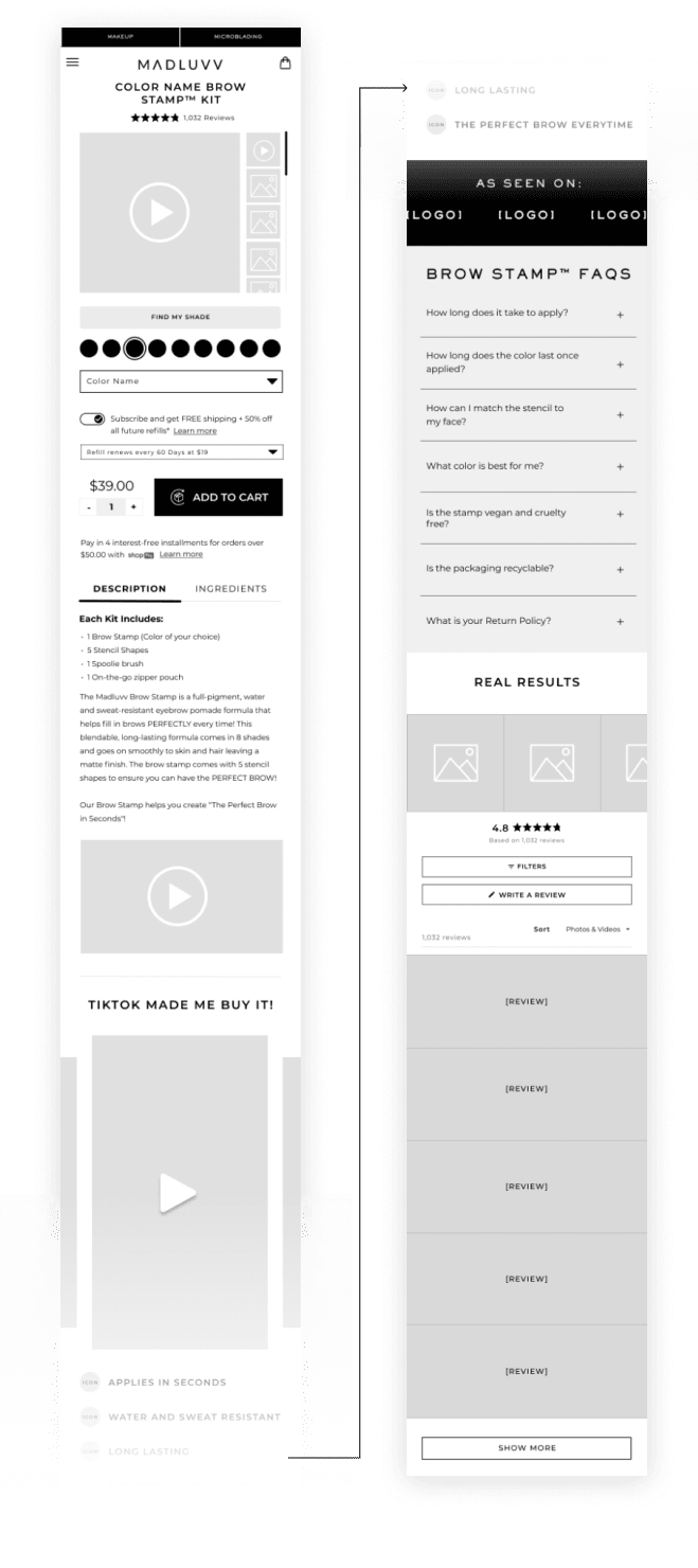
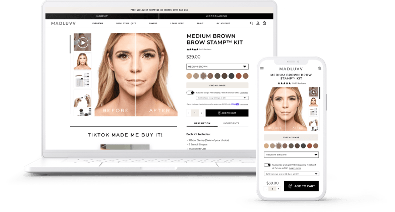


As a the Director of Product Design for MADLUVV I conducted heat map analysis and user testing to increase conversions on our product detail pages (PDP). I found that there were five key issues that may have been causing a lower conversion rate through user testing: poor product images, hard-to-make-out color swatches, too much information in expandable drawers, lack of social proof, and unaddressed customer questions or concerns.
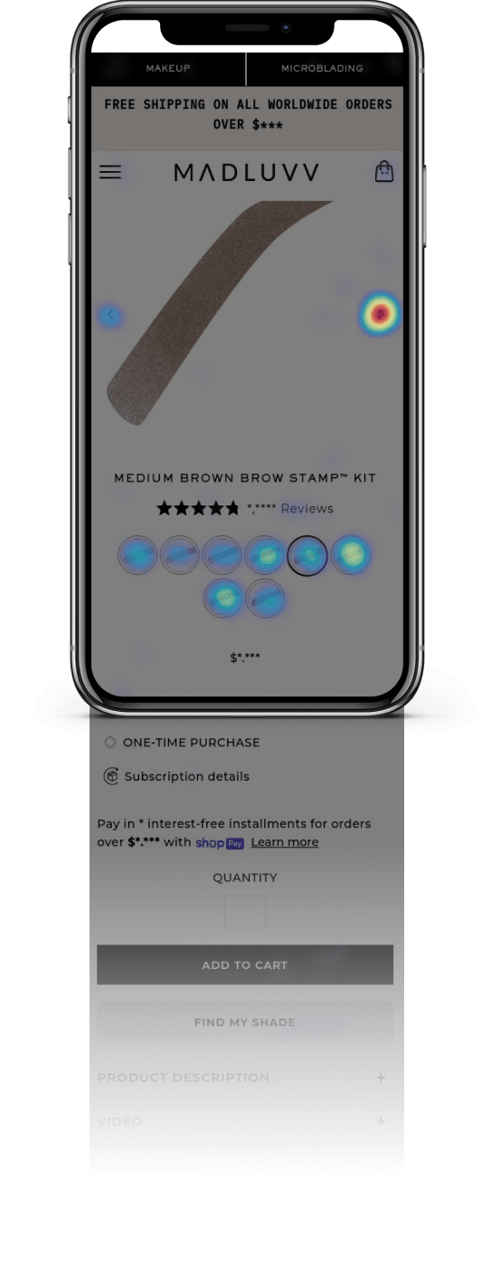
After reviewing the heat maps, I noticed that nearly 100% of clicks were above the fold, aligning with the user testing feedback. This suggested that the issues raised by users were reflected in their behavior on the website. I then used the findings to design low-fidelity wireframes of the MADLUVV product pages, focusing on creating a clear and intuitive user flow and keeping the most important elements above the fold.
After the final design, I monitored the heat maps and conversion rates, and observed a significant increase in conversions, with a 10-15% YoY increase. This indicated that the changes I made to the product pages were successful in improving the customer experience and encouraging more users to make a purchase. The heat maps also showed an improved customer journey, with users spending more time on the site and interacting more with the page.
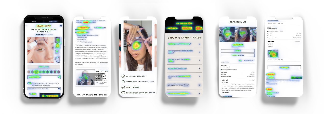
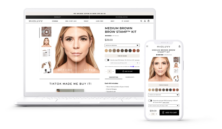
MADLUVV is one of the leading eyebrow cosmetics companies. In an effort to increase conversions on our product pages, I conducted UX testing using heat maps and user testing. Heat maps allowed me to see which elements on the page were most frequently used or clicked on by visitors. User testing gave me the opportunity to watch and listen to people who had used our website and gather valuable feedback about their experiences. By analyzing the results of these tests, I was able to identify areas for improvement on our product pages and make changes to increase conversions.
Figma | Hot Jar | UserTesting.com
There are a few key issues that were identified through user interviews that may be contributing to a lower conversion rate on the MADLUVV product pages.
First, the product images may not be doing a good job of showcasing the products. Customers may be having difficulty accurately visualizing the products due to poorly lit or low quality images, or because the images do not show the products from multiple angles. This can make it difficult for customers to determine the true color and appearance of the products, which can lead to uncertainty and hesitation when it comes to making a purchase.
Second, the color swatches may be hard to make out, which can also make it difficult for customers to confidently choose the right shade. Customers may feel uncertain about the color they are selecting, which can lead to a lower conversion rate.
Third, there may be too much information hidden within expandable drawers. Customers may have difficulty finding the information they need, or may feel overwhelmed by the amount of information that is available. This can lead to frustration and difficulty in making a purchase decision.
Fourth, there may be a lack of social proof on the product pages. Social proof, such as customer reviews or ratings, can help build trust and confidence in the products, and can be an important factor in the purchasing decision. Without this type of information, customers may feel less confident in their purchase.
Finally, the website may not be answering the questions or addressing the concerns that customers have. If customers have questions or concerns that are not addressed on the website, they may be hesitant to make a purchase.
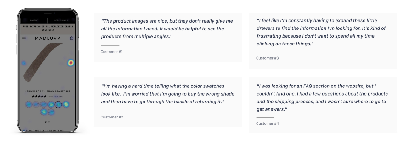
"The product images are nice, but they don't really give me all the information I need. It would be helpful to see the products from multiple angles."
"I'm having a hard time telling what the color swatches look like. I'm worried that I'm going to buy the wrong shade and then have to go through the hassle of returning it."
"I feel like I'm constantly having to expand these little drawers to find the information I'm looking for. It's kind of frustrating because I don't want to spend all my time clicking on these things."
"I was looking for an FAQ section on the website, but I couldn't find one. I had a few questions about the products and the shipping process, and I wasn't sure where to go to get answers.”
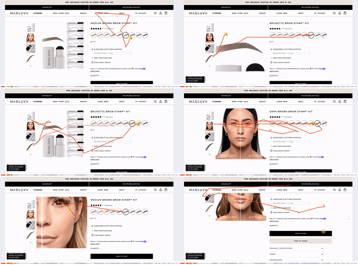
After reviewing the results of the user testing, I compared the feedback to the heat maps to see if there were any patterns or trends. I found that the heat maps and the user testing results were in alignment on several key issues.
One interesting observation I made while reviewing the heat maps was that nearly 100% of the clicks were above the fold. This means that all of the clicks on the website occurred in the portion of the page that is visible without scrolling. This could suggest that users are not scrolling down the page or that there is not enough compelling content below the fold to encourage them to scroll.
When I compared this to the user testing feedback, I found that many of the concerns or questions raised by users related to the areas of the page that were getting the most activity on the heat maps. This alignment between the heat maps and the user testing results suggests that the issues and concerns raised by users are reflected in their behavior on the website.
By addressing these issues and improving the customer journey, it may be possible to increase conversions and improve the overall effectiveness of the website. In particular, it may be helpful to consider ways to better utilize the space below the fold and provide more compelling content or calls to action to encourage users to scroll down and engage with the page.
Hotjar Screen Recording
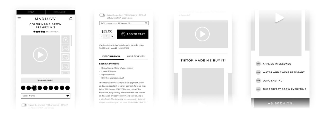
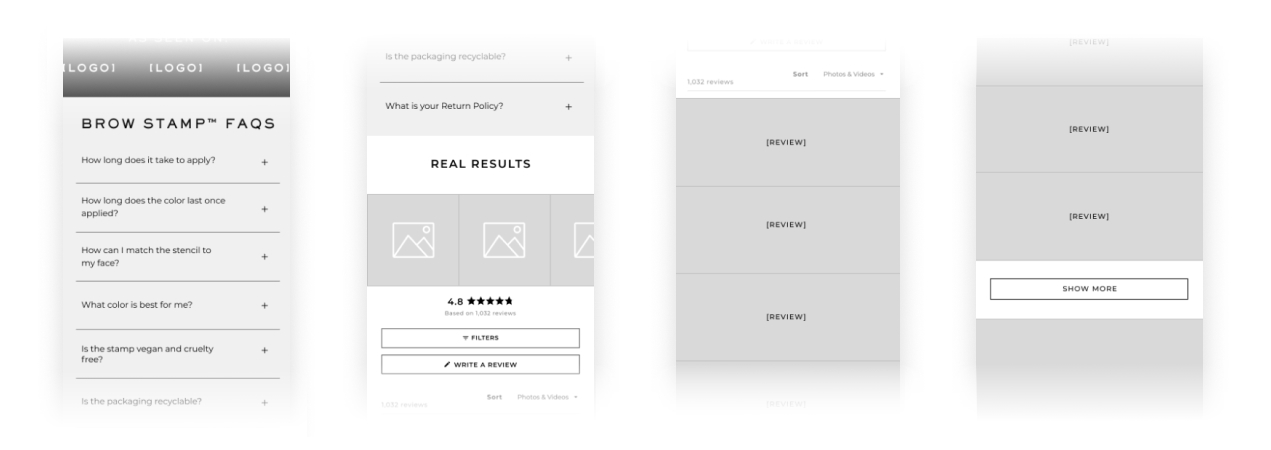
Using the information gathered from the user testing and heat maps, I was able to begin designing low fidelity wireframes of the MADLUVV product pages. Low fidelity wireframes are simple, rough sketches that outline the basic layout and functionality of a webpage without going into too much detail. They can be a useful tool for quickly testing ideas and gathering feedback.
To design the wireframes I first identified the key issues and pain points that were identified through user testing and reflected in the heat maps. I then used this information to brainstorm ideas for how to address these issues and improve the customer journey on the website.
One important aspect of the wireframing process was making sure that the most important elements of the page were kept above the fold, or the portion of the page that is visible without scrolling. With these ideas in mind, I began sketching out the layout and functionality of the product pages. I focused on creating a clear and intuitive user flow, and on organizing the content and features in a way that would be easy for users to understand and use.
I was able to successfully keep many of the key elements above the fold by organizing the content and features in a way that made efficient use of the available space. This included prioritizing the most important information and placing it at the top of the page.
After completing the final design of the MADLUVV product pages, I monitored the heat maps and conversion rates to see how the changes were affecting the customer journey and overall effectiveness of the website.
Overall, I observed a significant increase in conversions, with a 10-15% increase YoY (year over year). This suggests that the changes made to the product pages were successful in improving the customer experience and encouraging more users to make a purchase.
The heat maps also showed an improved customer journey, with users interacting more with the page and spending more time on the site. This was a result of the changes that were made to the page layout and design, as well as the improved organization and presentation of the content.
